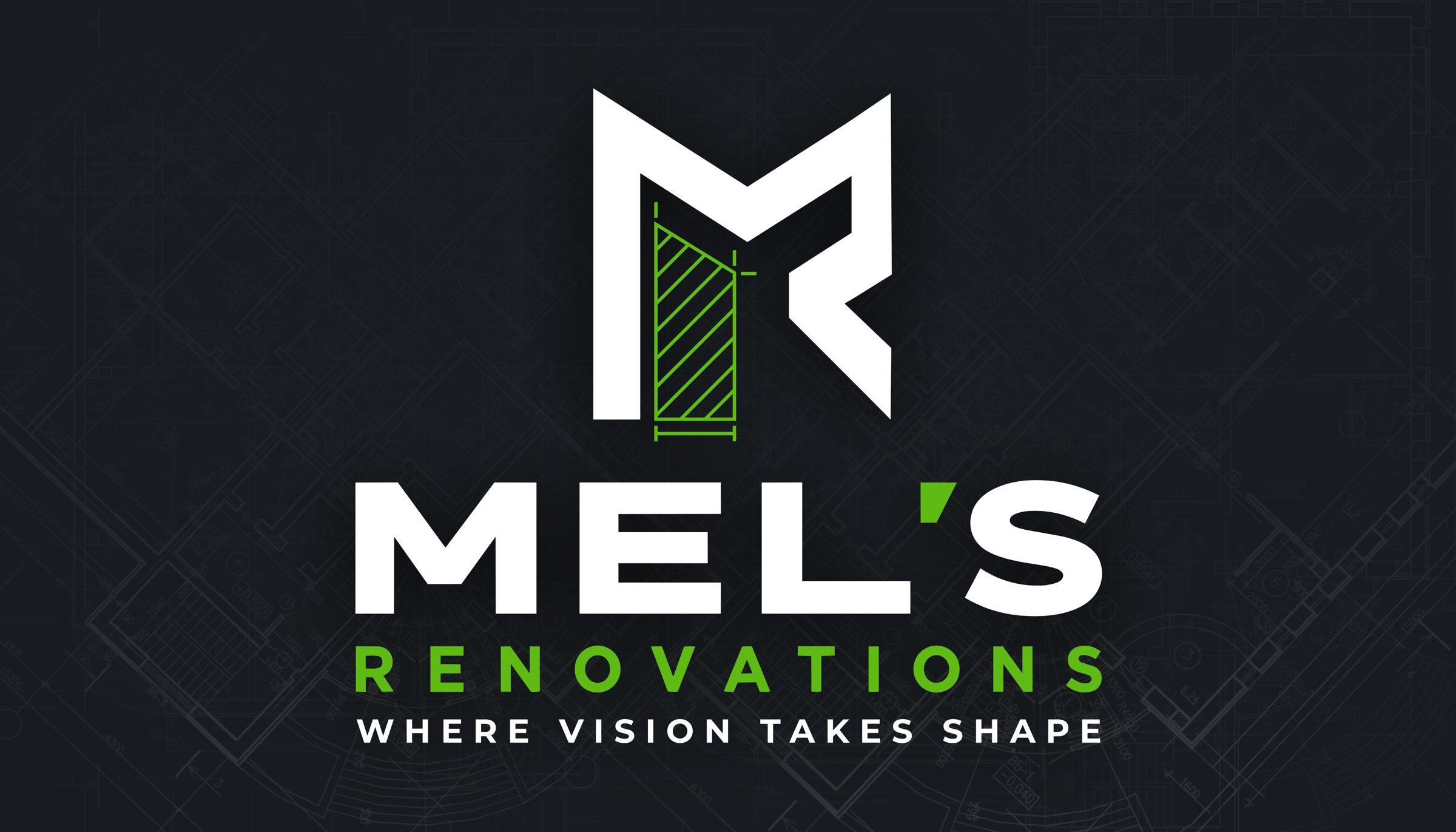
A renovation starts as a drawing on a plan. So does the mark.”
The brief
The earlier identity, a house outline in orange, read like real estate. The new one had to say renovation, and work from a business card up.



The mark
An M and an R built from the same strokes. One leg is left open and drawn the way a contractor marks a wall to be rebuilt, so the mark shows the work before the name does.
The hatching is the only green in it. Everything else is a single color, so the mark holds when it has to print in one.
Plan green
#60BA14
Charcoal
#23272C
Ink
#181B1F
White
#FFFFFF
Color
Green is kept for the plan details and the rules between the trades, the way a site marker shows where to cut. It never fills a large area.
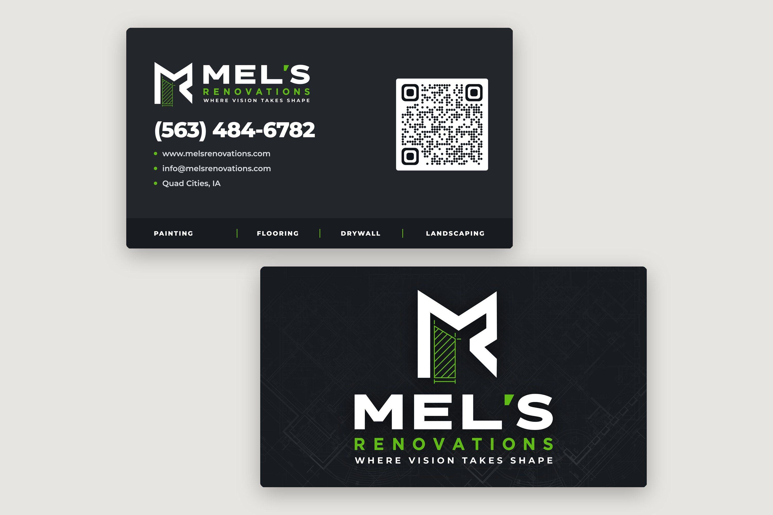
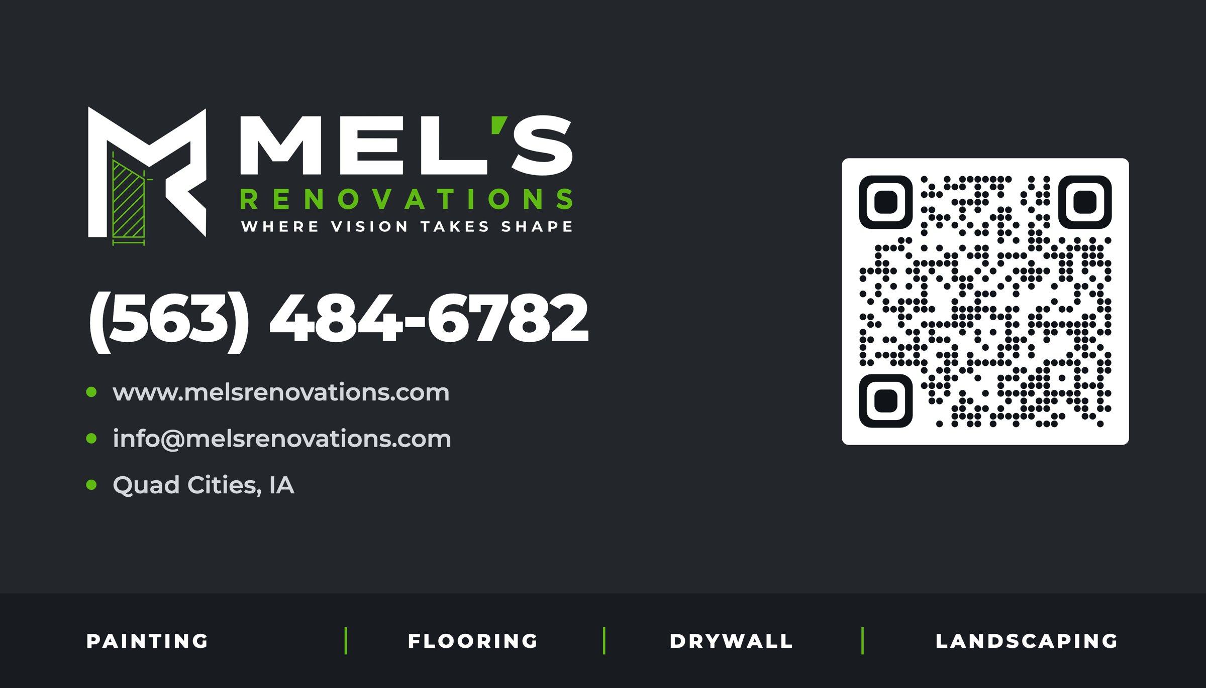
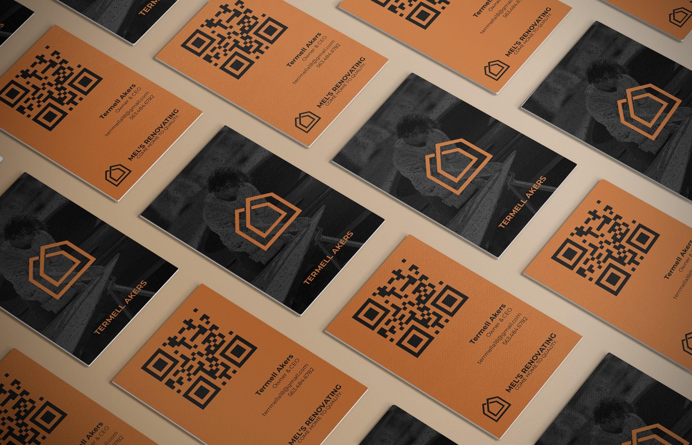
The back sets the phone number at the size of a headline, because that is what people keep a contractor's card for. The site, the email and a QR code follow, and the four trades run along the bottom edge.
The result
A lockup, a standalone mark for small spaces, a four-color palette and print-ready cards with bleed and cut lines, all delivered as vector files.
About the project
A new identity for a renovation company.
Mel's Renovations paints, lays floors, hangs drywall and landscapes across the Quad Cities. We drew the mark, set the palette and designed the business cards, and handed everything over as print-ready vector files.
Client
- Mel's Renovations
Sector
- Retail and services
Discipline
- Brand identity
Timeline
- 2026
Category
- Brand identity
Deliverables
- Logo and monogram
- Color palette
- Business cards
- Print-ready files