A family's private network should be calm, honest and theirs.”
Whose side it is on
Most software is built for whoever is sending the message. Guardian is built for the family on the receiving end, and it stays on their side.


The mark
A shield with a G cut through it, beside the name in heavy capitals. The shield is the only red in the whole system; words and buttons are a deep navy, and nothing is ever solid black.
The lockup is built on one measure, the height of its capitals: the gap between shield and word is half of it, and the clear space around the logo is all of it.
Navy
#1F2937
Guardian red
#DC2626
Information blue
#0066CC
Confirmation green
#00A91C
Quiet
Silence means nothing needs you. There are no streaks, no badges and no “all good”; Guardian speaks only when something changes or needs a person.
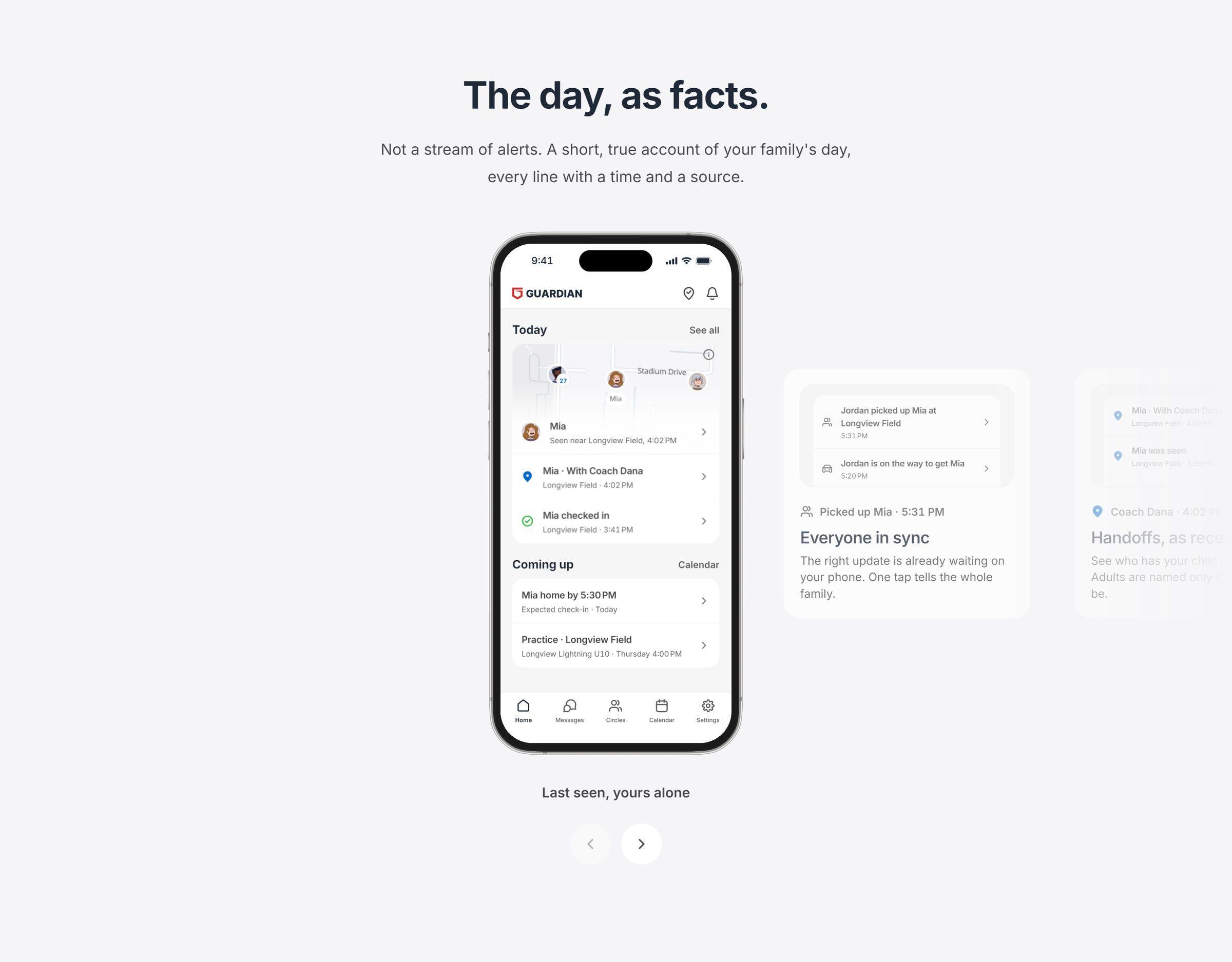
When it does speak, it states facts: “checked in”, “seen at 4:02”. It never says “safe”, because a device can't know that.
The website
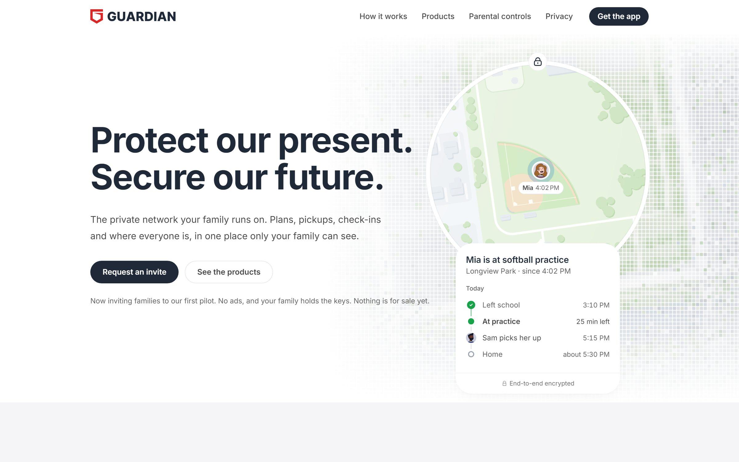
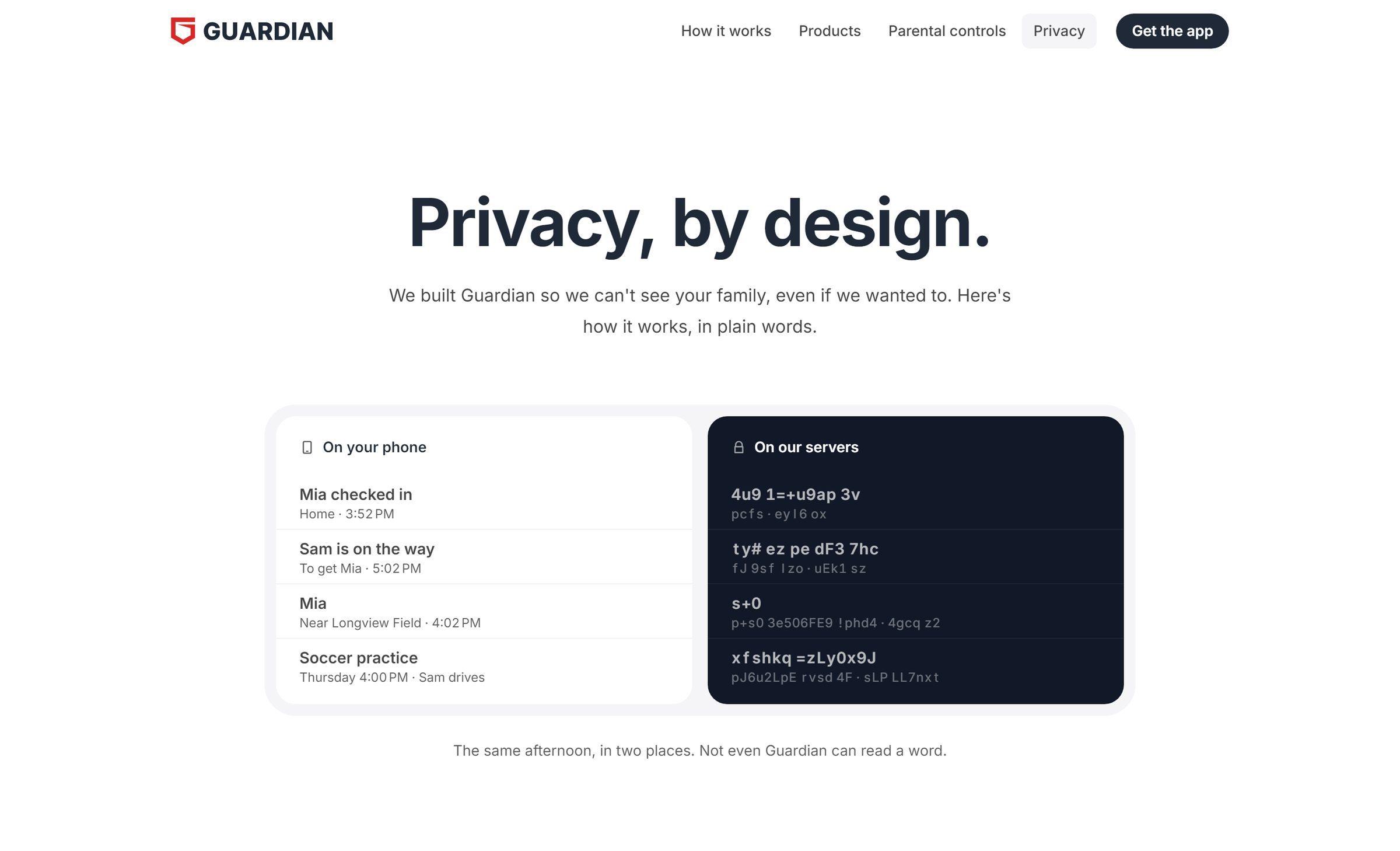
The site says what the product does and nothing it can't back: set up the family on the phones it already has, say the plan once, hear back without asking, and share only on your own terms.
Privacy is said where it's a fact. A line like “only your family can see this” repeated on every screen reads like a worry, so it appears once, where it matters.
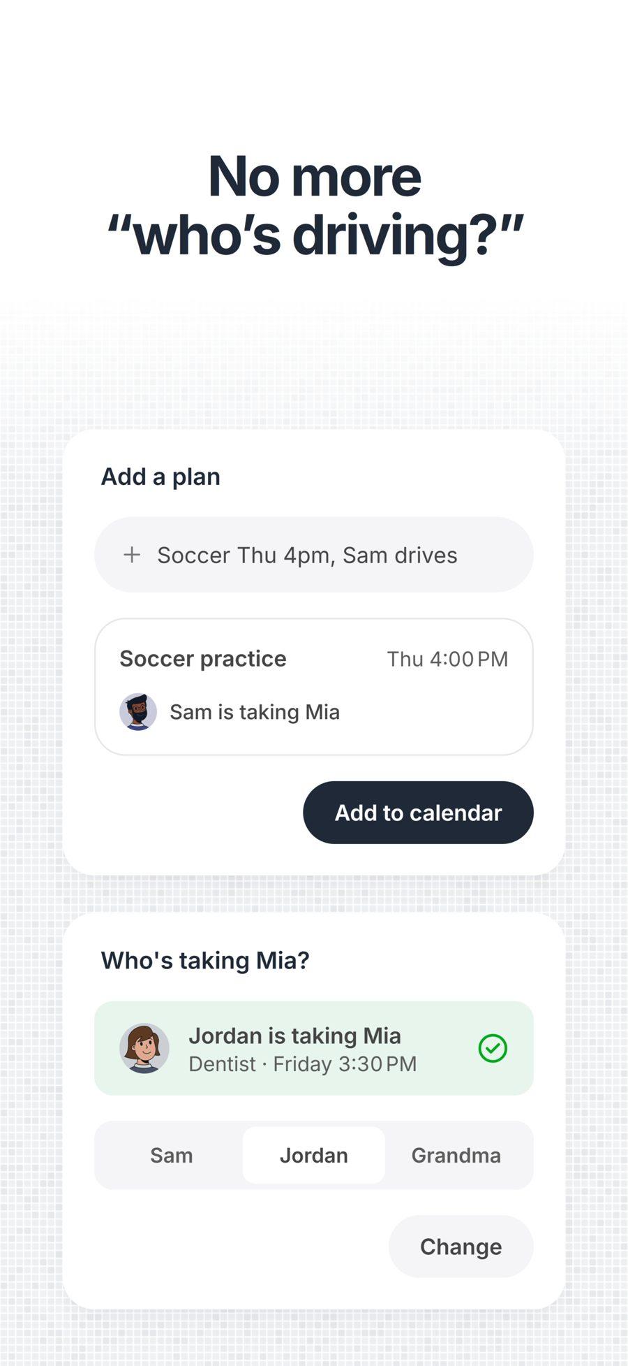
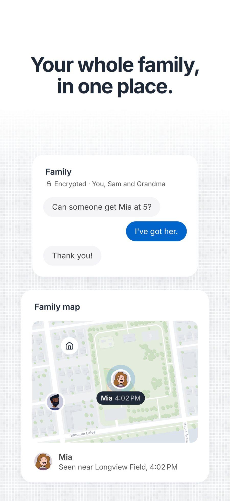
The app
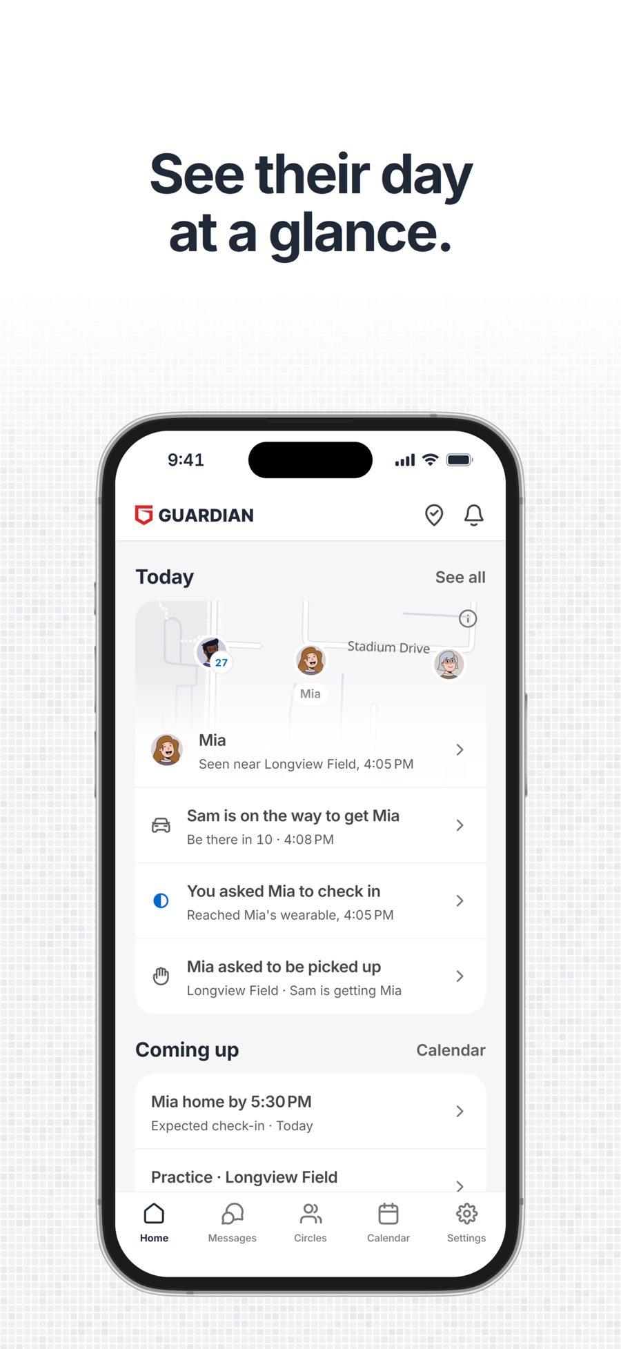
One family calendar, check-ins and pickup requests that arrive as short facts, and sharing that only happens when both people agree. The tap a child feels on a device is the pattern the parent's phone plays: one for a check-in, two for “come get me”.
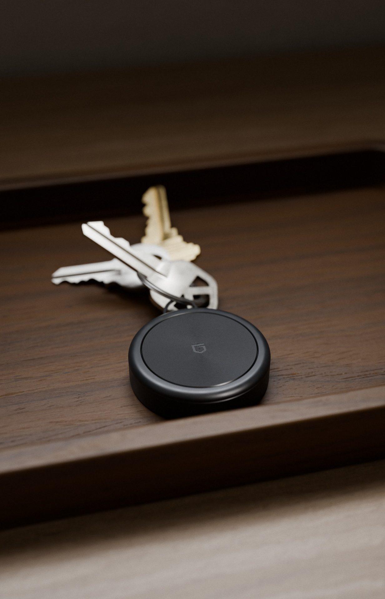
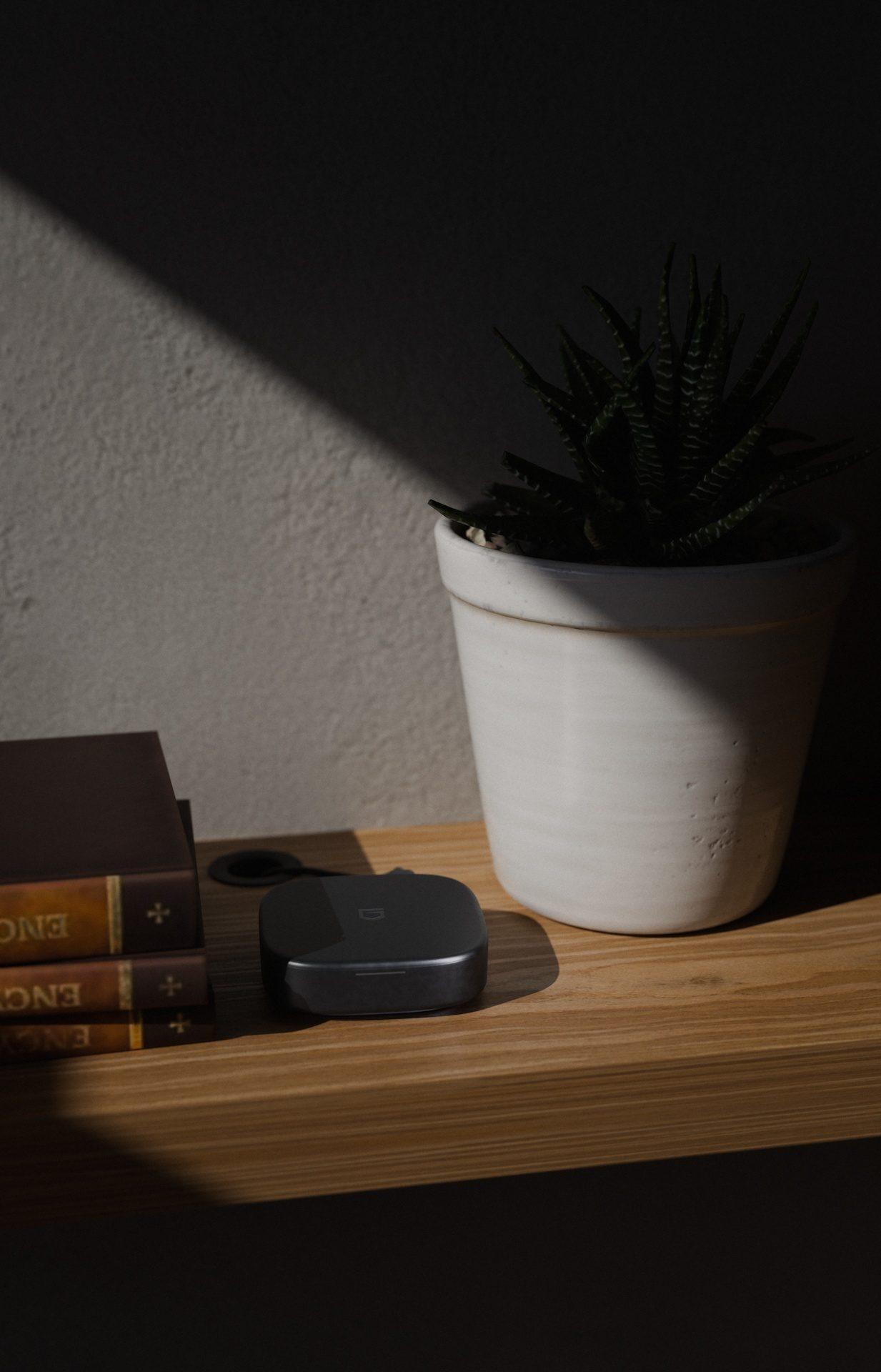
The devices
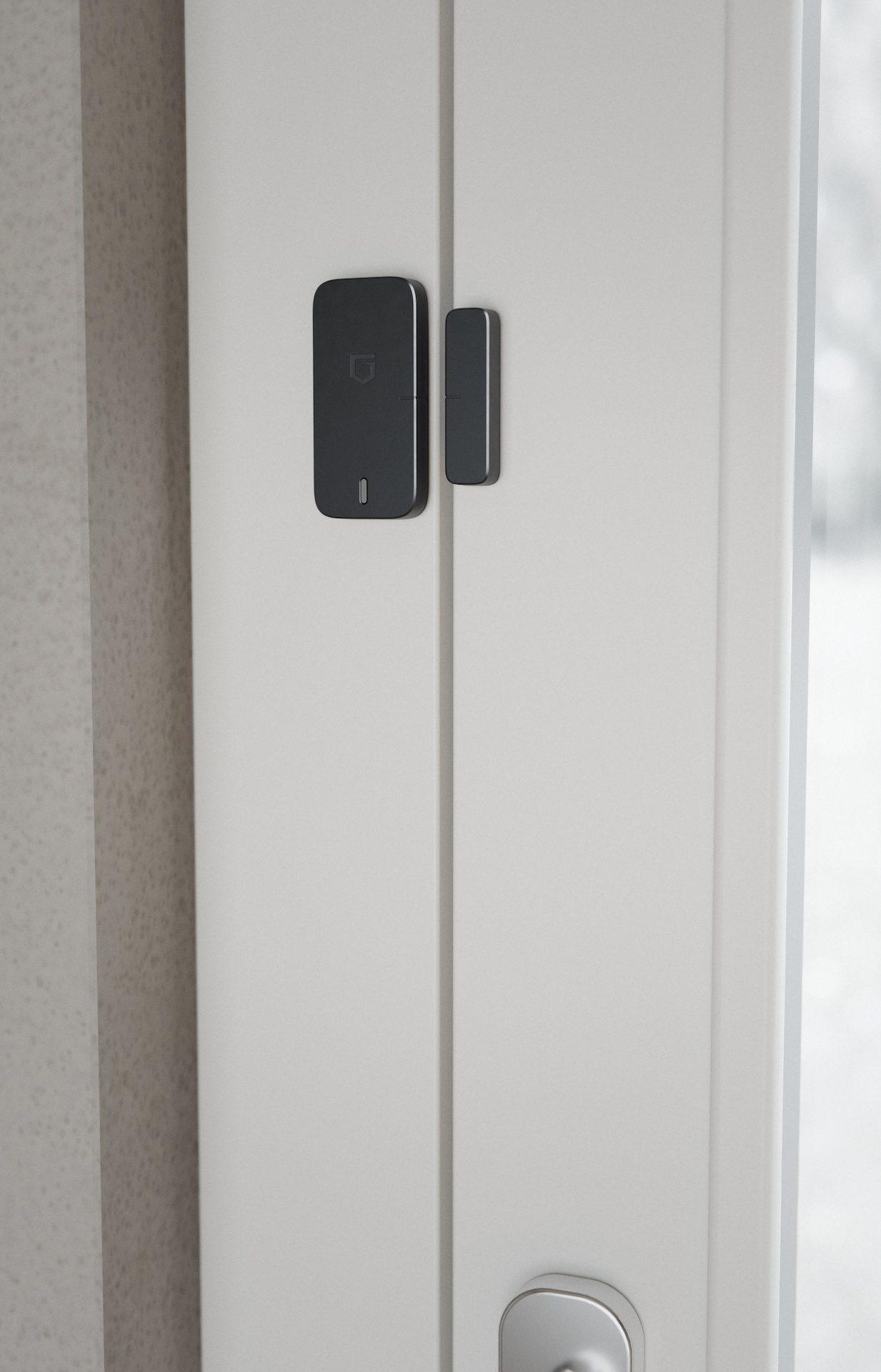
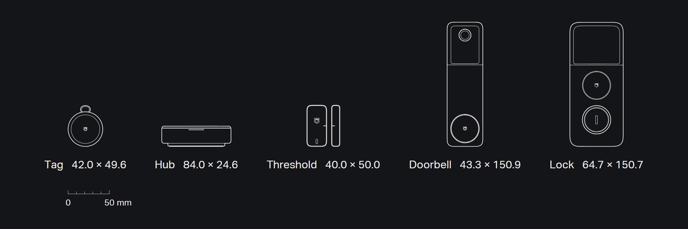
A Tag for keys and bags, a Hub that keeps the family's data at home, and Threshold for the doors that matter at night. The Doorbell shows who's at the front door and records to the Hub, never to a cloud. The Lock opens for the family's phones, a tap of a child's Tag, a code for the sitter or a key, and locks itself when the door shuts. They should feel considered in the hand and discreet on the body: soft edges, a low center of gravity, the mark flush rather than raised, and seams and screws on the back.
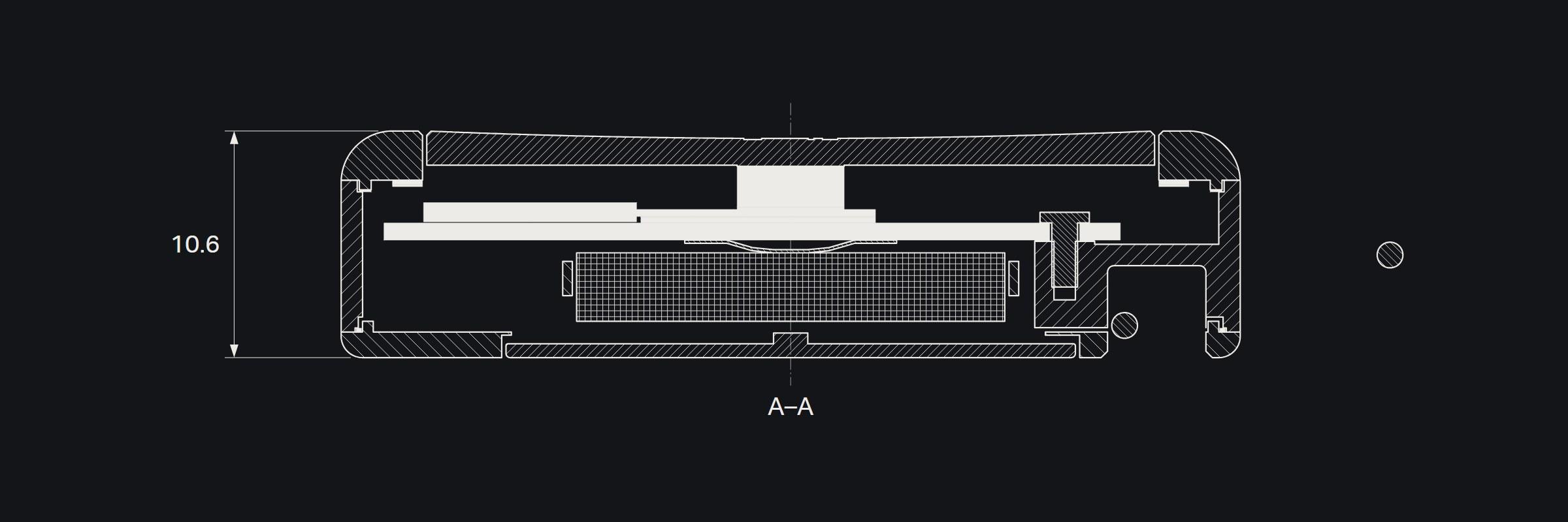
A box full of parts isn't industrial design. Every visible detail has to earn its place, and the thickness comes from what the parts need, never from stacked cases. All five are still in design.
Drawn to the millimeter
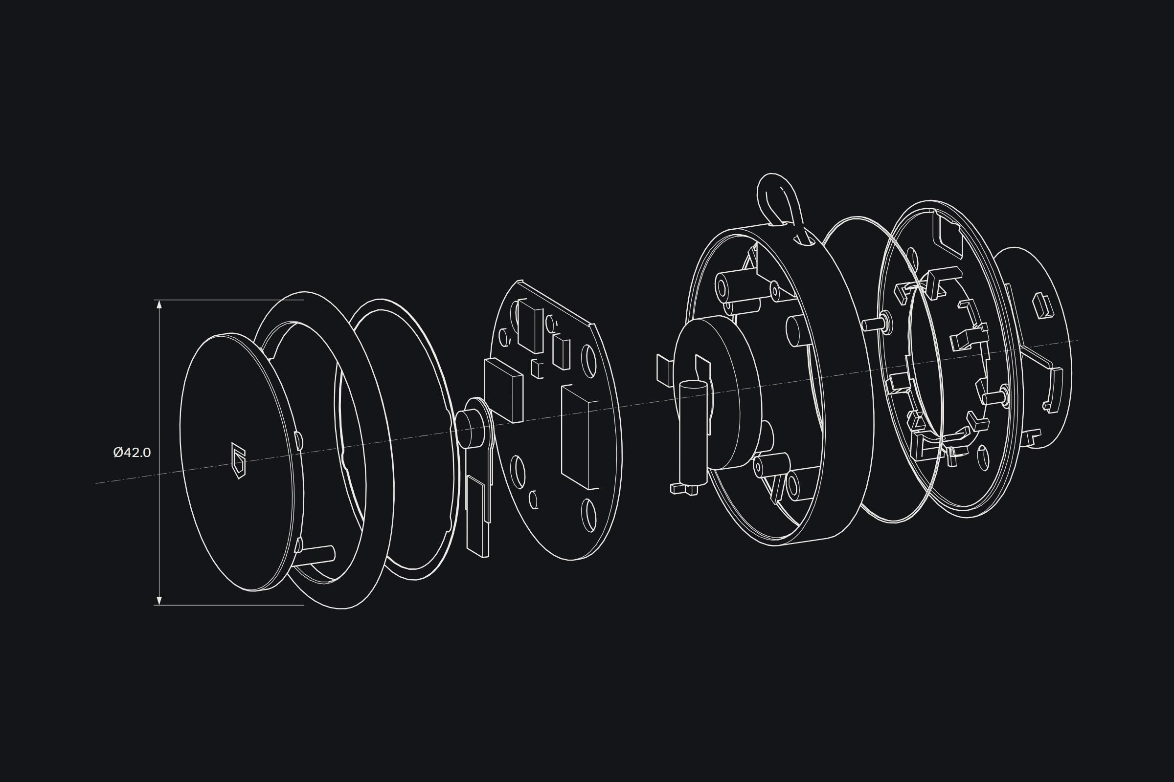
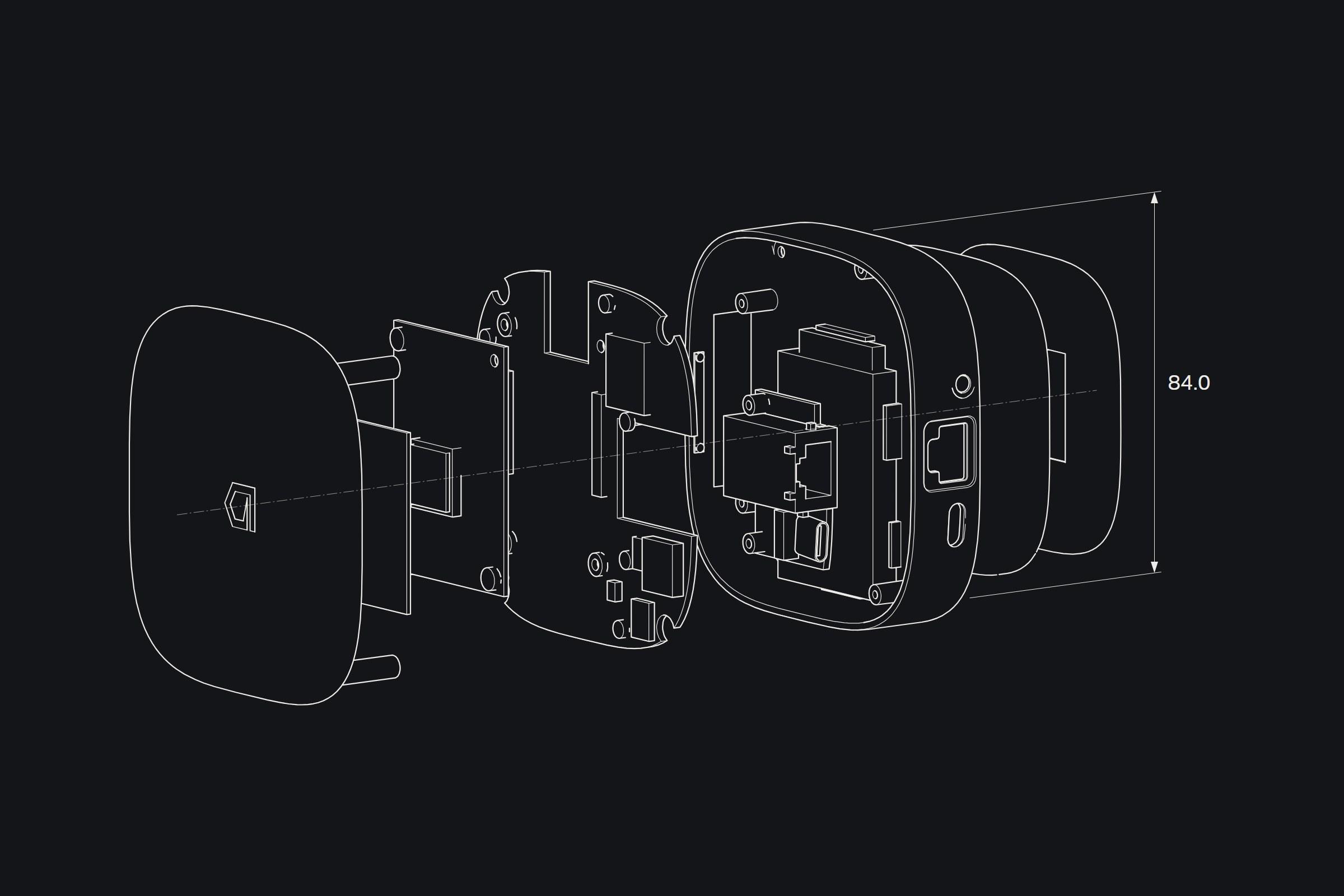
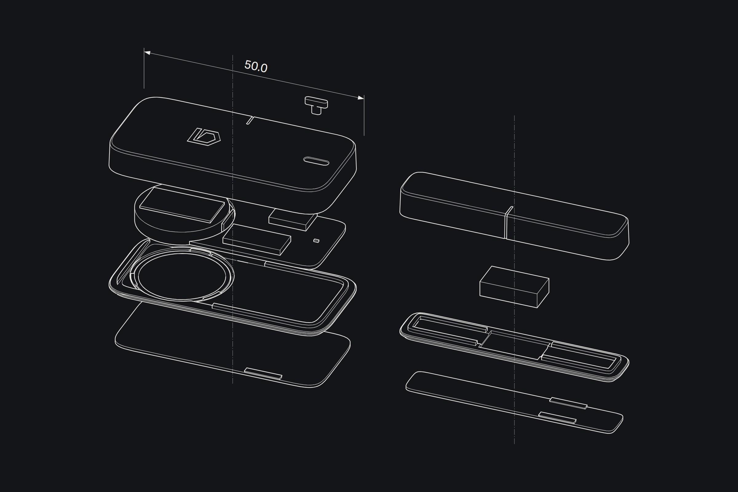
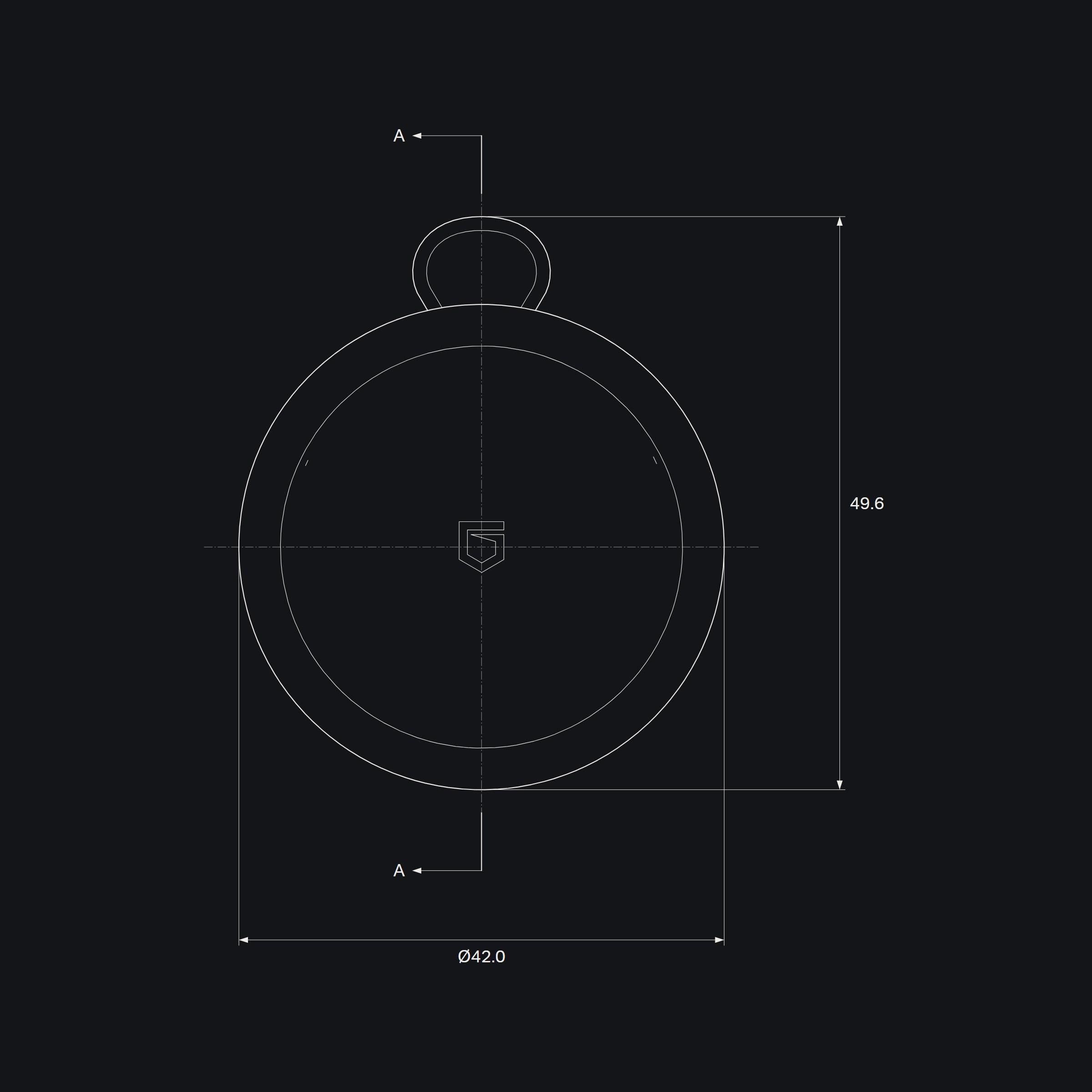
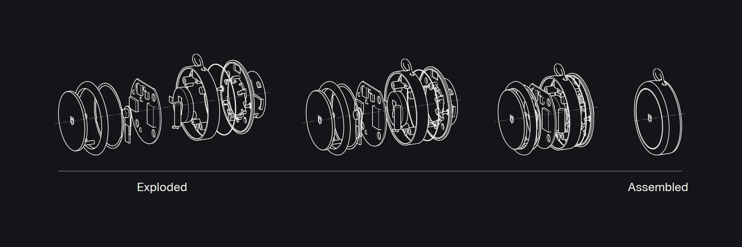
Every device is drawn the way it will be built: taken apart along one axis to show how it goes together, cut through the middle to show what fills it, and measured. Each line is the edge of a real part, with the hidden ones left out.
The drawings share the cover's graphite and fine white line, so the hardware reads as part of the same system as the app and the site.
The result
One system, from the shield to the screws: the same navy, the same quiet, the same honest language on the phone, on the site and on the devices.
About the project
The private network a family runs on.
Plans, pickups, check-ins and where everyone is, in one place only the family can see. The phone app is the product; small devices bring in the people who don't carry a phone, and a Hub keeps the family's data at home. One codebase holds the app, the website and the Hub's software.
Client
- Guardian
Sector
Discipline
- Brand identity
- Websites
- Apps
Timeline
- 2026
Category
- Apps
Deliverables
- Identity and logo
- Design language
- Website
- iPhone and Android app
- Device design